ROSTIC'S Kiosk
Increased loyalty sign-in conversion by 45% and raised charity donations by 1.7x
Platform
Self-service kiosk
Skills
UX/UI, Prototyping, DS
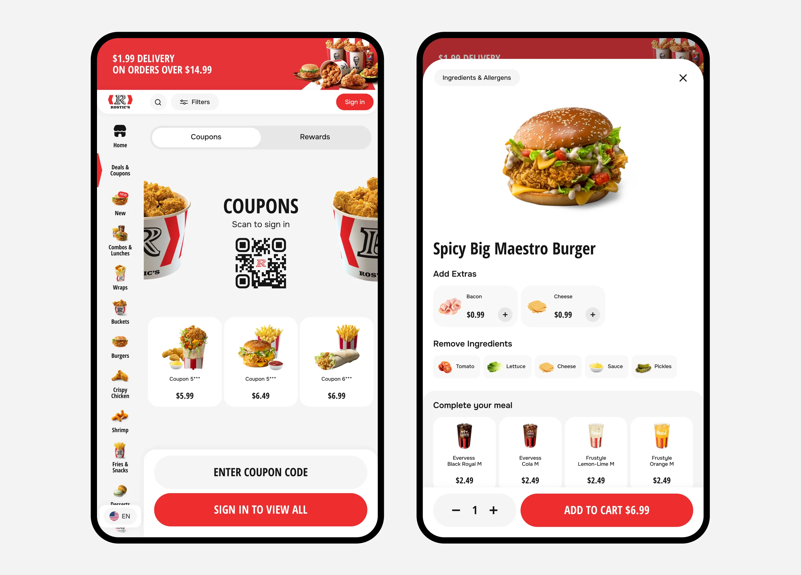
Low sign-in conversion in kiosk flows.
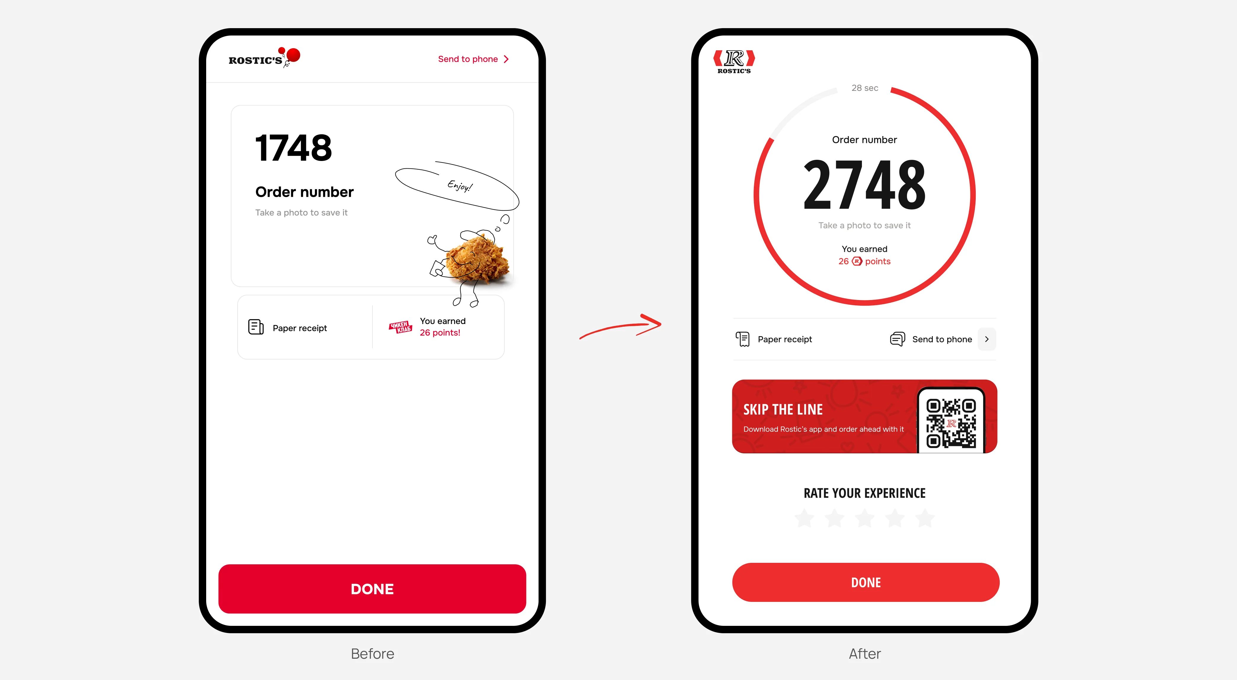
Users dropped off on the charity screen and often failed to notice their order number. This created frustration and increased the workload for restaurant staff.
Slow checkout increased queues in restaurants and contributed to customer churn.
Low conversion to donations for the partner charity.
The ordering flow was complex, especially for combo meals and customizable items.
Users frequently selected dine-in instead of takeaway (or vice versa), causing confusion during order pickup.
Users often failed to notice their order number on the final screen.
To increase customer loyalty and repeat visits, we needed to encourage more users to join the loyalty program by improving kiosk sign-in
During research and live testing, I found that users did not want to enter their phone number for two reasons:
— restaurants are often crowded, and users don't want to enter their phone number in public;
— entering a phone number takes time, while most users come to kiosks expecting a fast ordering experience.
Based on these findings, I hypothesized that sign-in should be faster, more private, and clearly communicate the benefits of the loyalty program.
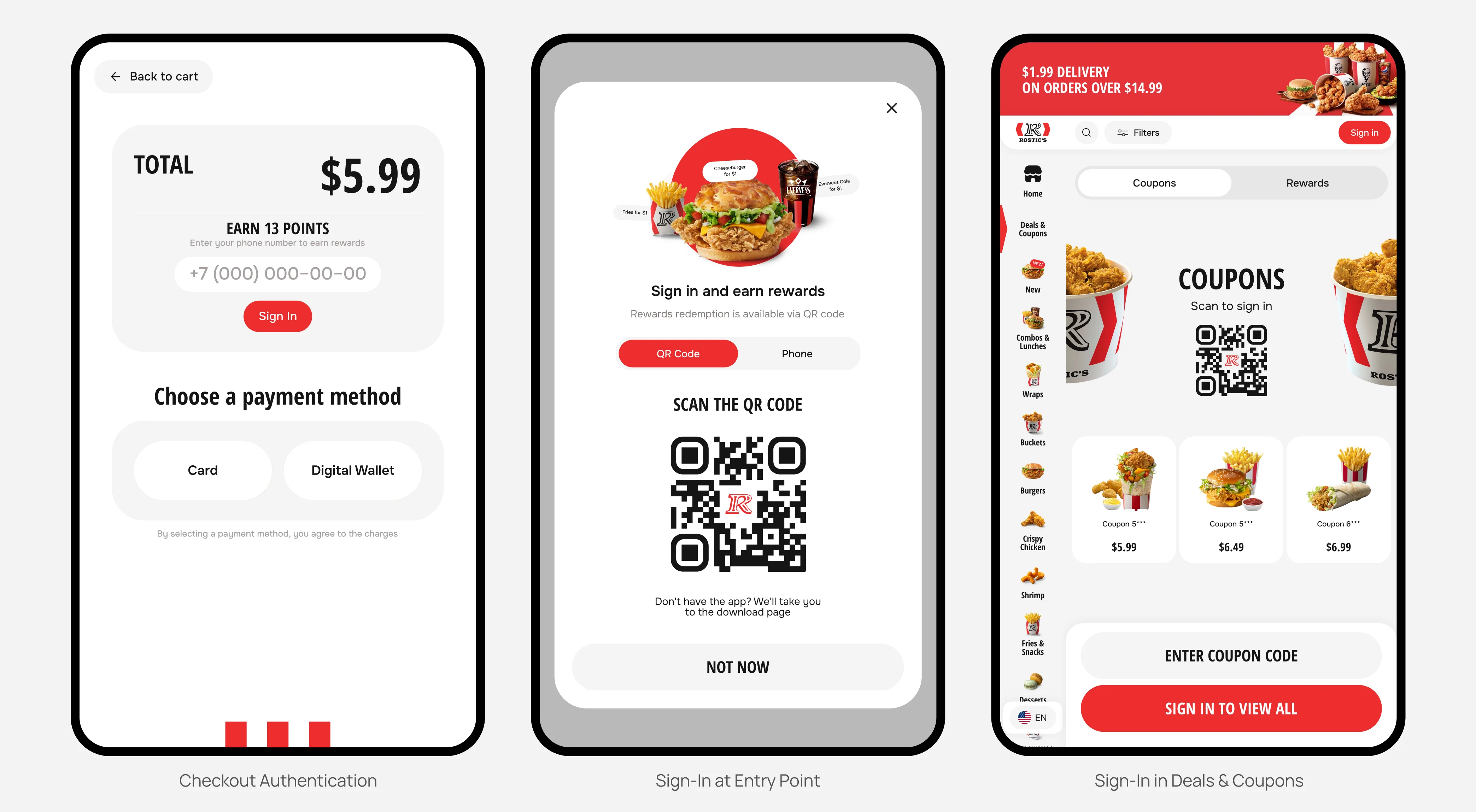
I introduced QR-code sign-in. This improved both loyalty sign-in conversion and app adoption.
I added sign-in touchpoints at the most impactful moments:
— at the start of the flow;
— on the home screen, highlighting loyalty benefits;
— at checkout, highlighting missed benefits;
— in the cart.
Loyalty sign-in conversion increased by 45%.
Data analysis, benchmarking, prototyping, stakeholder presentations, and final UI design.
The project focused on two key challenges:
— users abandoned the kiosk on the charity step and did not see their order number, creating frustration and increasing staff workload;
— increase donation conversion.
Previous final-step flow:

My first hypothesis was that the full-screen charity step made users feel the ordering flow was complete, causing confusion.
When users failed to notice their order number, donating became a lower priority because they first wanted to resolve their order.
The visuals felt overly staged, making the charity seem less urgent and reducing users' willingness to donate.
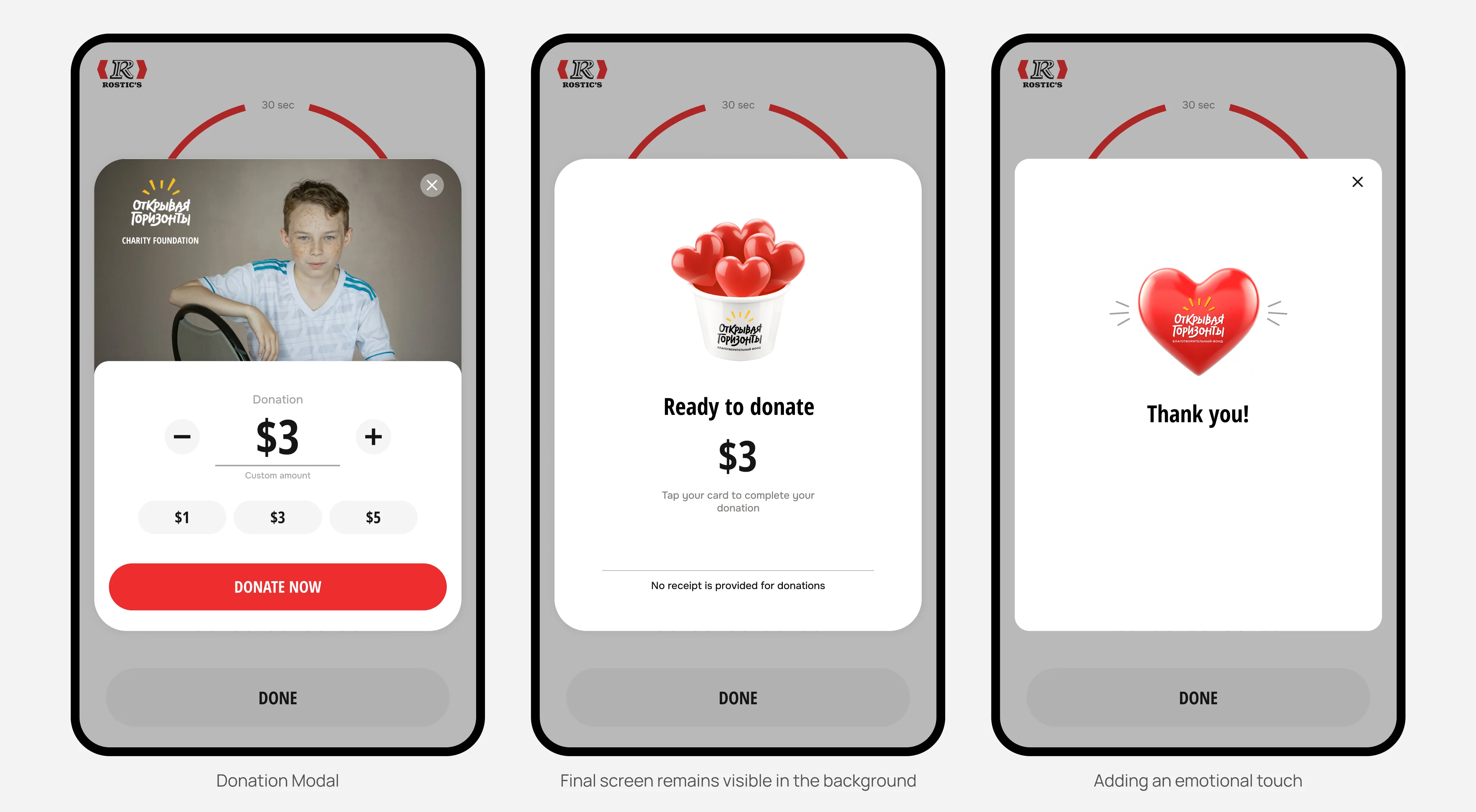
I kept the same step order but replaced the full-screen charity step with a modal overlay, so the final order screen remained visible in the background. This reduced uncertainty around the order number.
I redesigned the charity screen and proposed a more authentic, emotionally engaging visual direction for the charity.
Charity-step conversion increased by 1.7x.
Data analysis, benchmarking, collaboration with the charity partner, prototyping, client presentations, and final UI design.
You can learn more about this and other cases during a call. You can also read the kiosk article on the Chulakov website. — Read article