ROSTIC'S App
Improved usability, reduced ordering time, increased average order value, and modernized the visual design in a single redesign
Platform
iOS, Android
Skills
UX/UI, Prototyping, DS
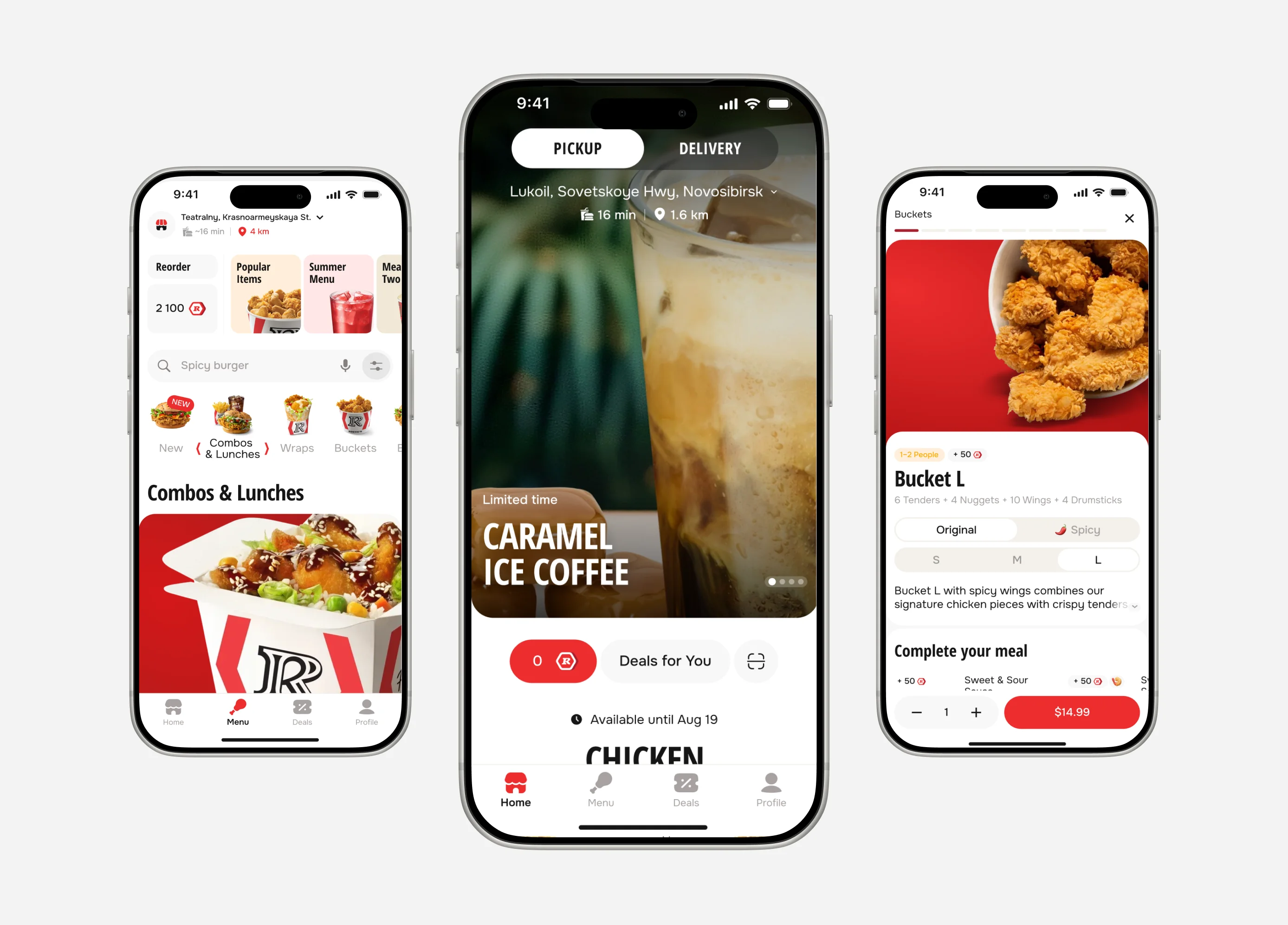
Users frequently selected the wrong restaurant or delivery address, increasing support requests and order issues.
Duplicate menu items reduced product discovery and made new dishes less visible. Increasing average order value required better visibility of the full menu.
The ordering flow was not efficient enough to support future growth and operational scaling.
Users noticed promotions but often failed to understand their value, resulting in low engagement and lower average order value.
The interface no longer met modern user expectations. Outdated UX patterns and visual design made key actions harder to discover and complete.
Many users accidentally placed orders to an old or a friend's address and noticed the mistake only after checkout.
The menu structure made product discovery difficult. Users had to navigate through duplicate items that differed only in size instead of discovering a broader range of dishes.
The interface added friction to routine tasks instead of simplifying them.
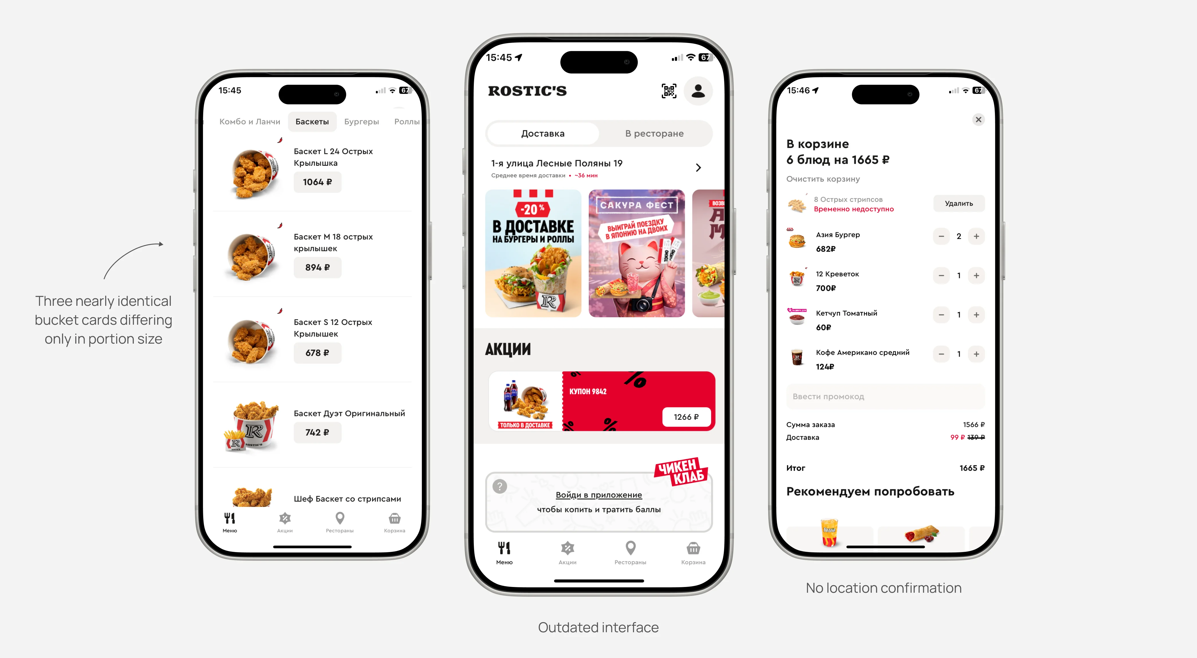
Support data analysis revealed that users paid attention to the address only when switching between delivery and pickup.
We also observed a significant time gap between selecting an order type and completing checkout.
Based on best practices, we formed two hypotheses:
Delivery: introduce an additional address confirmation step immediately before checkout, when user attention is highest.
Pickup: reinforce the selected restaurant visually, helping users quickly recognize familiar locations.
We introduced an address confirmation modal before checkout, bringing users' attention back to the selected delivery address.
For pickup orders, we added restaurant photos to help users quickly recognize and verify the selected location.
We expected the extra confirmation step to negatively impact the experience, but usability testing showed no significant issues.
Testing results indicated a potential 15-30% reduction in support requests.
Conducted audits and data analysis, created research prototypes and final designs, and presented design solutions to stakeholders.
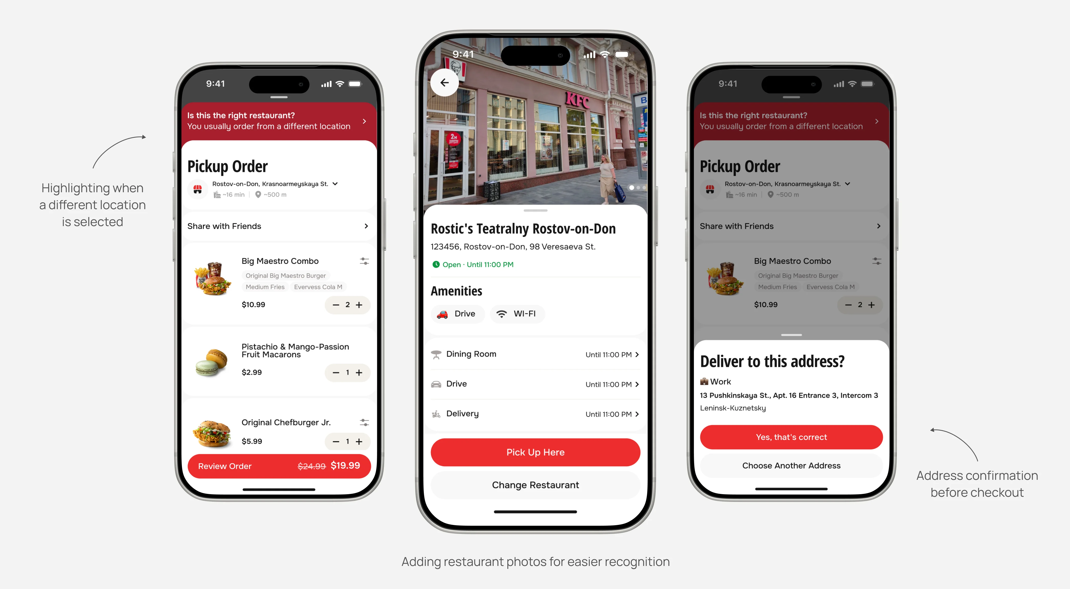
One of the main product issues was menu duplication. Multiple variations of the same item could occupy an entire mobile screen.
Our goal was to improve conversion by increasing product discovery and menu variety visibility.
Hypothesis: consolidate duplicate items into a single product card.
Items varied by:
- flavor (Original / Spicy)
- size
- flavor variants (desserts and milkshakes)
The audit revealed that the Original/Spicy variation was the most frequently used customization.
This led to a second hypothesis: expose the Original/Spicy toggle directly in the menu grid while keeping more complex customizations inside the product page.
We conducted quick hallway testing and found that a spice-level toggle was the most intuitive interaction pattern.
More complex products are customized within the product page. We also highlighted upsell options there to increase average order value (AOV).
After several testing iterations, we confirmed that the spice-level toggle was the most intuitive option for users.
Product variety within orders increased. Users added dishes directly from the menu grid. Upsell opportunities within product pages increased average order value.
The time required to build an order decreased: products requiring no customization, or only a spice selection, can now be added in one click from the menu grid.
Led audit and data collection, designed product-card experiences, and presented design decisions to stakeholders.
You can learn more about these and other cases during a call.