Expero Design System
Simplified the interface architecture, unified three design systems, and reduced UI inconsistency to support product scalability
Platform
iOS, Android, Web
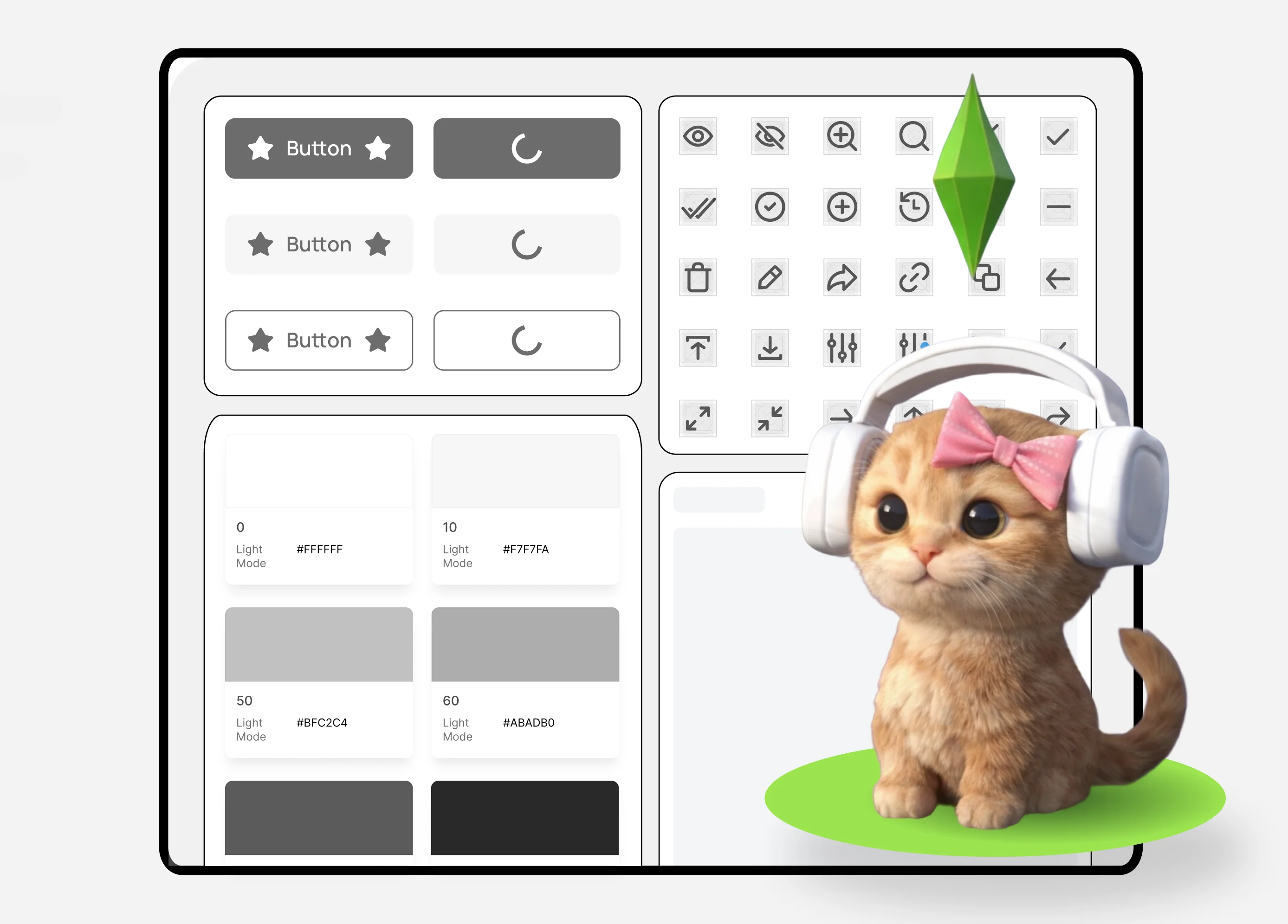
Expero is a pharmacy reservation platform connecting over 40,000 pharmacies across Russia. The product is developed across Web, iOS, and Android. By the time I joined, three independent design systems and numerous custom solutions had accumulated over several years, making the interface difficult to maintain.
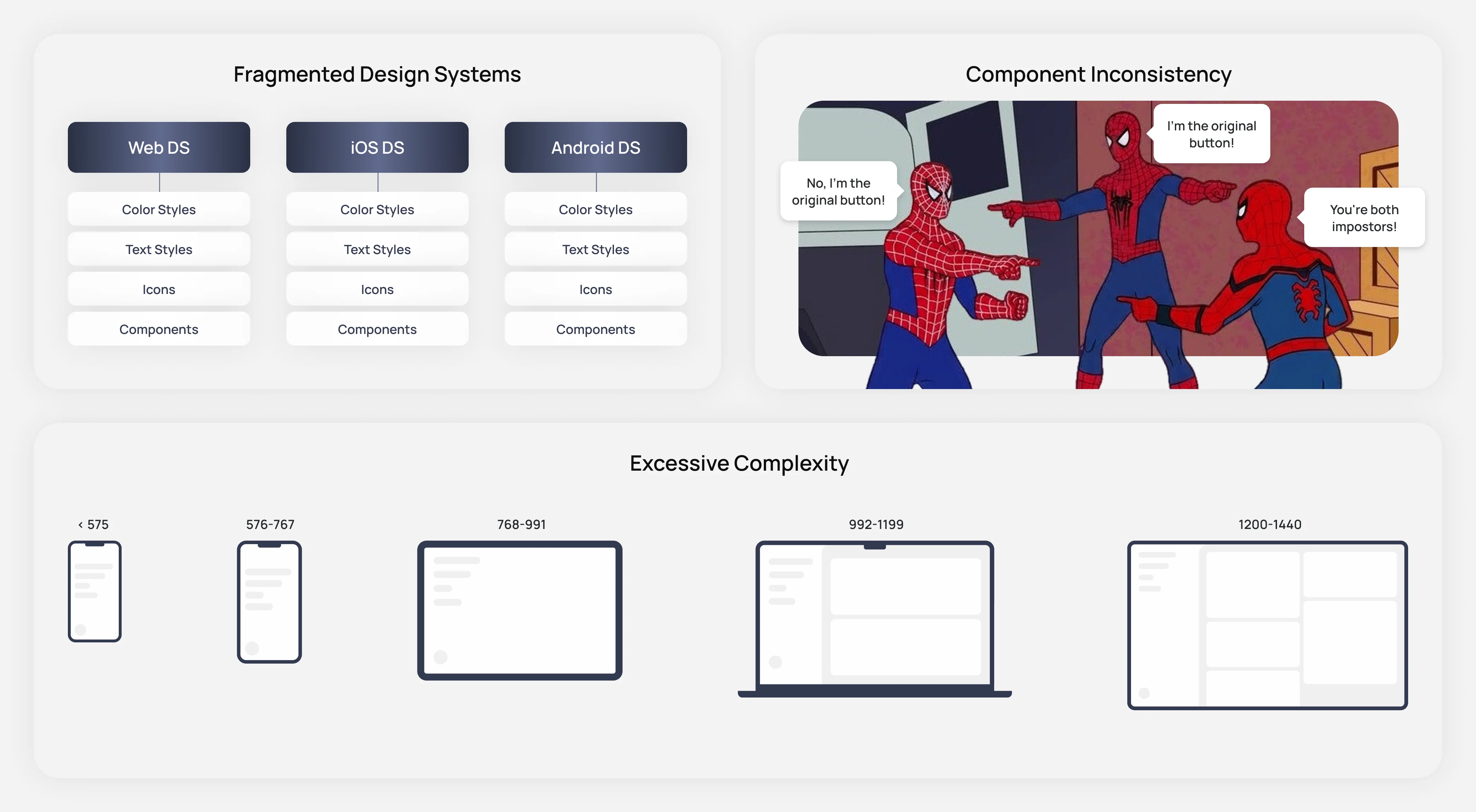
Three independent design systems existed across platforms, each with its own fonts, colors, styles, and components. Maintaining separate component libraries and layouts significantly slowed design work.
Around 30-40% of components lived in local files, and identical product entities were represented by different parent components, creating inconsistency across the system.
The web platform relied on five breakpoints, requiring components and layouts to be recreated multiple times. This slowed both design handoff and future maintenance of the product.
Product impact: both layout production and long-term support were heavily slowed down.
Create a single source of truth for interface decisions, reduce design variants, and simplify product support for both design and engineering.
Before starting the redesign, we defined a set of principles to guide the future design system.
Core principles:
- a single source of truth through one shared token system and atomic component library;
- simplify the Web design system to two breakpoints (desktop and mobile), with components and layouts designed to adapt instead of being duplicated;
- merge iOS and Android into one shared cross-platform App Design System;
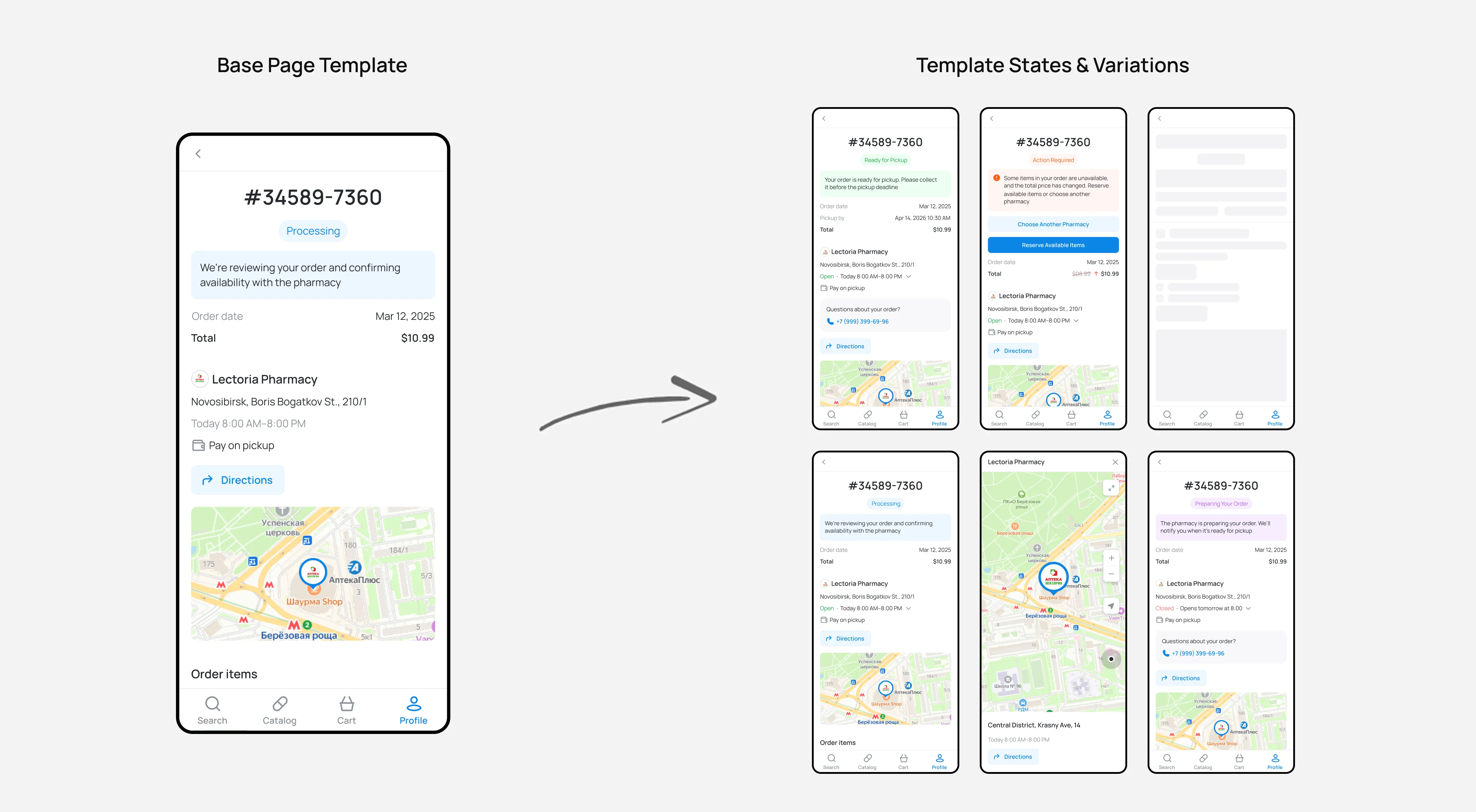
- introduce Page Template Components-for example, a single Profile Page Template that assembles all page states and variants while reducing layout assembly errors.
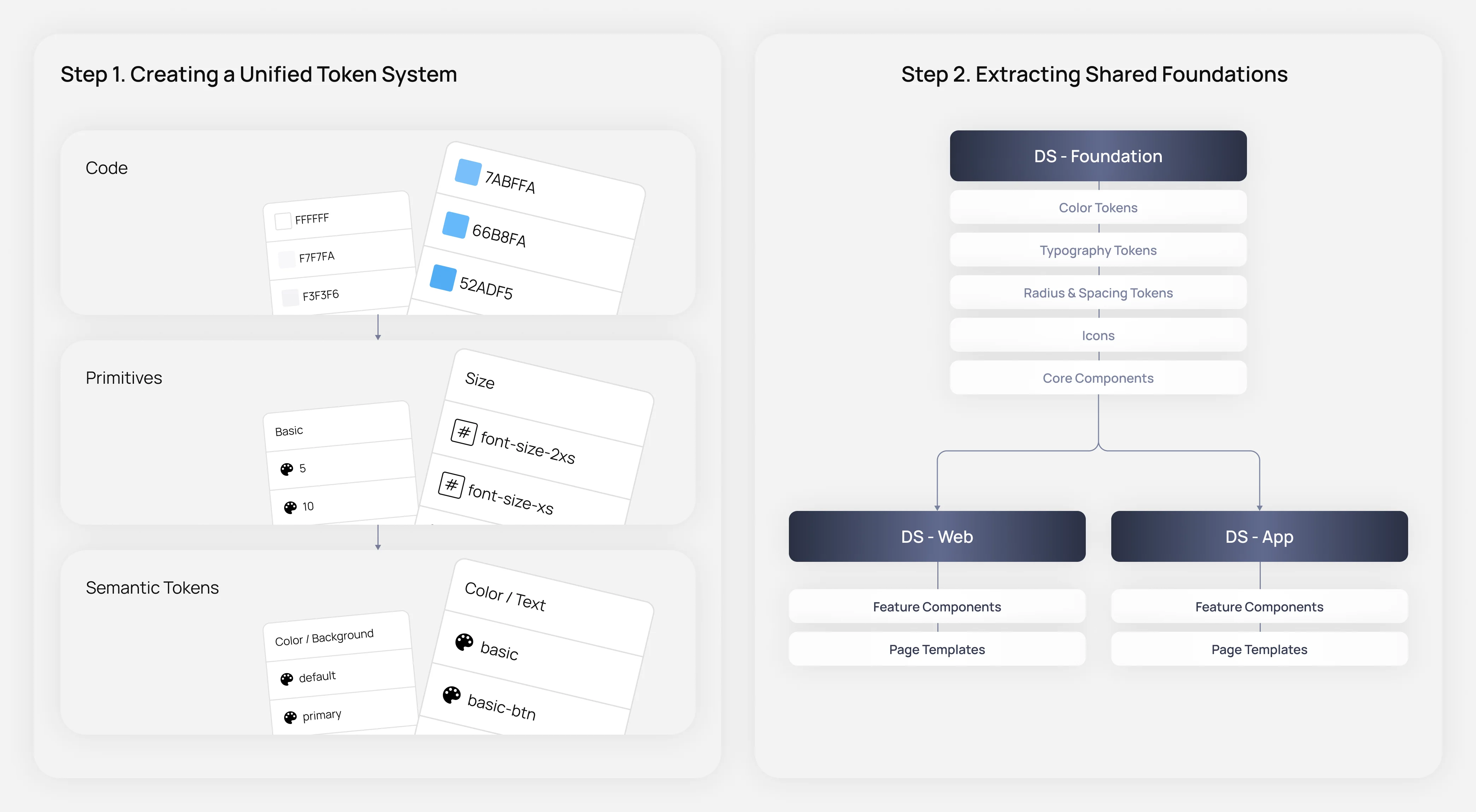
To establish a consistent foundation, I first built a shared token library and core UI elements, including buttons, labels, badges, and checkboxes etc.. Since the goal was to merge the mobile design systems, we deprecated the iOS library and used Android as the baseline.
Step 1: build a unified token system for all platforms, including:
- colors;
- typography;
- spacing and corner radius.
For color architecture, I introduced a three-layer structure: Color -> Primitive -> Semantic, making the system more flexible and easier to scale.
Step 2: Extract shared atomic components. After reviewing both mobile libraries, Android was chosen as the foundation because it was the more optimized system. The next challenge was replacing equivalent components efficiently in the Web Design System.
I solved this using Figma Swap Instances. After several experiments, we confirmed it supported large-scale batch replacement, eliminating a significant amount of manual work.
As a result, colors, typography, spacing, and core atomic components became unified across all platforms.
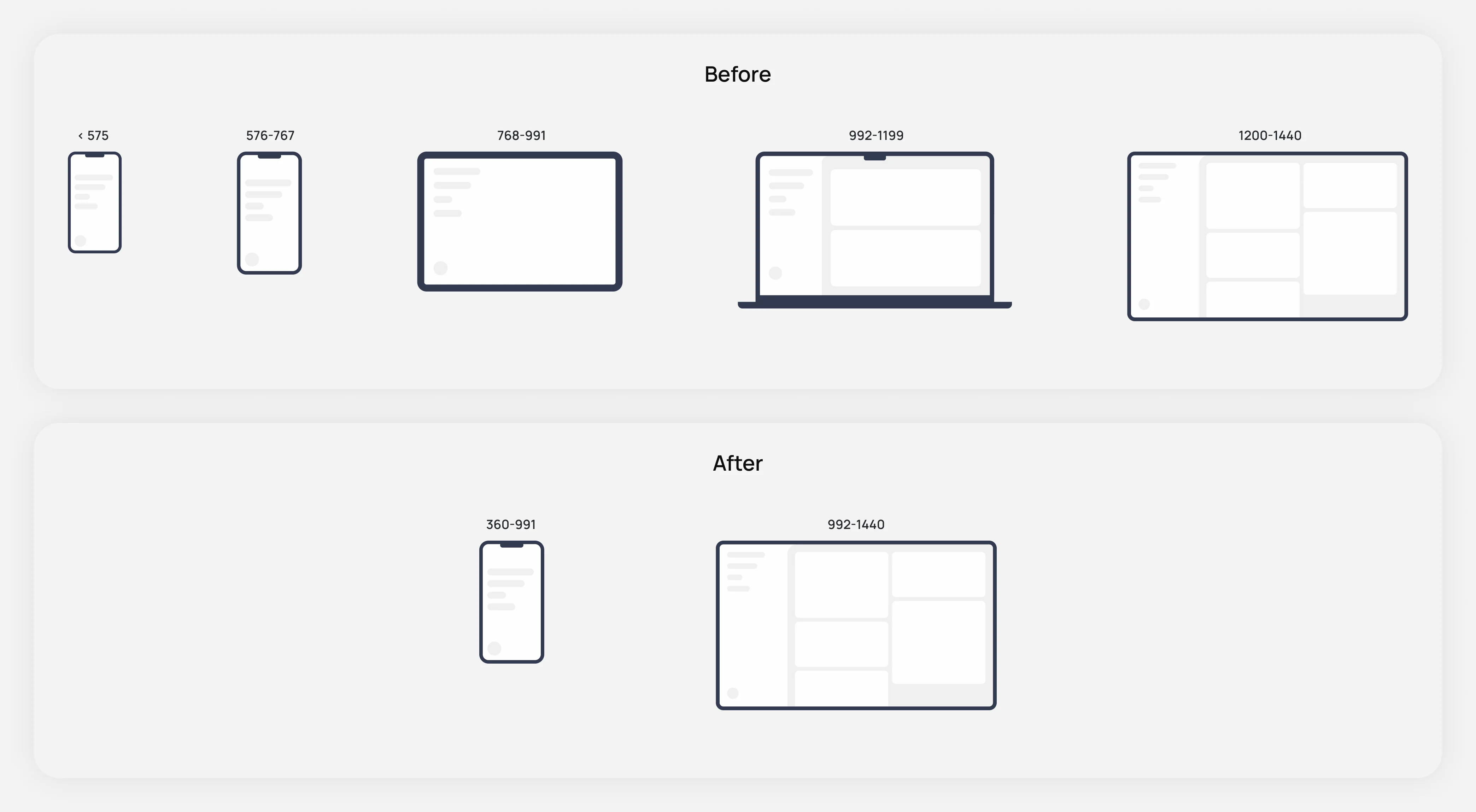
Product analytics showed that tablet users accounted for less than 1% of traffic, making a dedicated tablet breakpoint difficult to justify.
We simplified the responsive system to two breakpoints:
- 360-991px as mobile;
- 992px and above as desktop.
Every component was then refactored to adapt seamlessly across these ranges while preserving visual consistency and usability.
This reduced the number of layouts prepared for engineering by 50%.
To reduce layout inconsistencies and accidental editing errors, I introduced Page Template Components that allowed complete user flows to be assembled from predefined page templates.
Instead of building screens from individual frames, designers now composed flows using just one or two parent components. Files became structured around reusable child components rather than standalone layouts, making accidental changes far less likely. Maintenance also became significantly simpler, as updates only needed to be made once at the parent component level.
Throughout the refactor, I worked closely with engineers to align implementation details and streamline the design handoff process. The engineering team built Storybook components while we reviewed them together through iterative design reviews.
As a result, developers reported faster implementation, fewer UI inconsistencies, and a more efficient workflow when working with design files.
You can learn more about these and other cases during a call.