Expero App & Web
Built an alternative acquisition channel and increased new-user conversion by 40% within six months. Introduced medication alternatives
Platform
iOS, Android, Web
Skills
UX/UI, Research, Prototyping
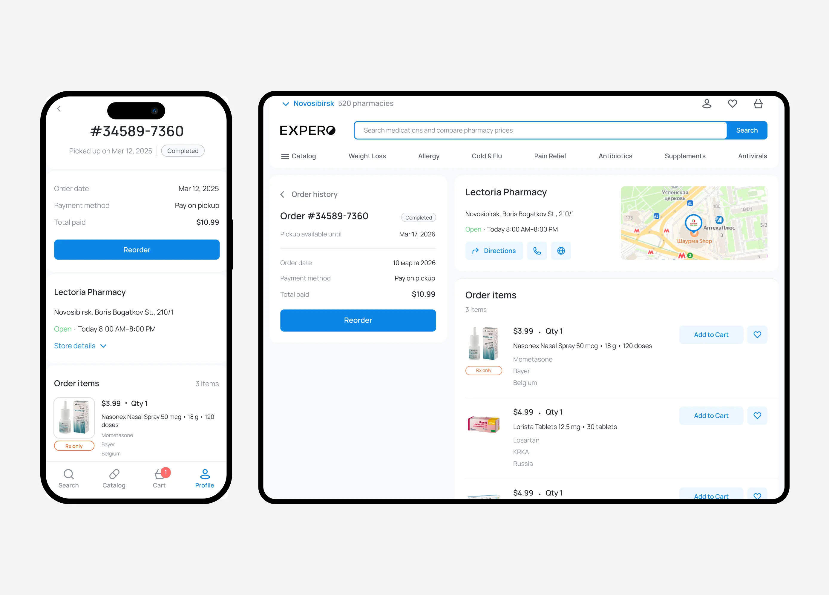
The business relied heavily on paid acquisition channels with a high CAC. We needed an alternative growth channel that could drive organic acquisition and reduce customer acquisition costs.
We also aimed to improve search-to-cart conversion, reduce zero-result searches, and recover orders when the requested medication was unavailable.
Users frequently encountered medications that were unavailable in their region. This resulted in abandoned purchases, lower conversion, and a poorer user experience.
Our goal was to build an organic acquisition channel that would reduce CAC.
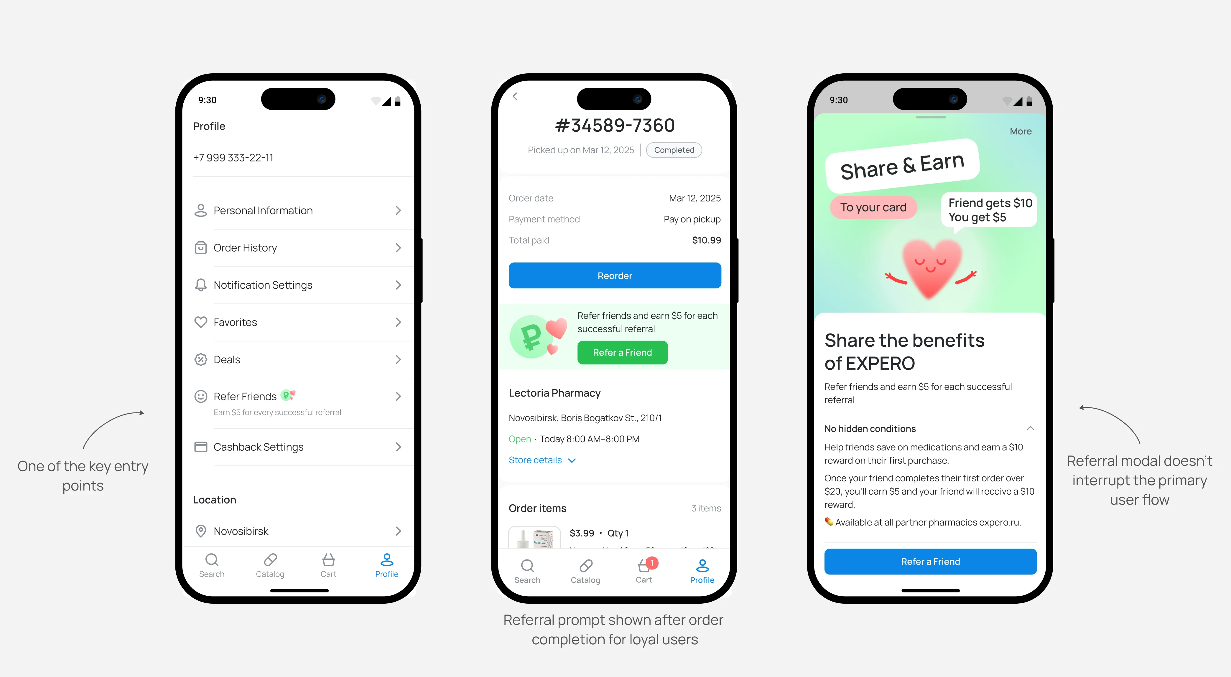
Together with the marketing team, we analyzed competitor referral programs and hypothesized that a two-sided referral incentive would attract new users at a lower CAC than paid channels.
We needed to validate both the reward amount and the most effective entry points. I created interactive prototypes and conducted quantitative testing across different age groups. The findings showed:
- an inviter reward of around 500 RUB performed best;
- the most intuitive entry points are home, profile, and post-checkout order screen.
I kept the referral experience inside the core pharmacy booking flow instead of sending users to a separate page. I introduced a modal flow that preserved the primary user flow.
Based on the research findings, I designed and launched the referral program across all platforms. Rewards were paid only after the referred user redeemed their order, preventing referral abuse.
CAC for referred users was significantly lower than across paid acquisition channels. Within six months referred users accounted for 40% of all new users.
Next step: run A/B tests to identify the minimum reward amount without reducing conversion.
Conducted data analysis, created research prototypes, ran quantitative testing, presented and defended solutions, designed final UI, and performed design reviews.
The goal was to reduce zero-result searches and recover purchases when a requested medication was unavailable.
After benchmarking competitors, I formed a hypothesis: showing medications with the same active ingredient would increase the likelihood of purchase even when the requested brand was unavailable.
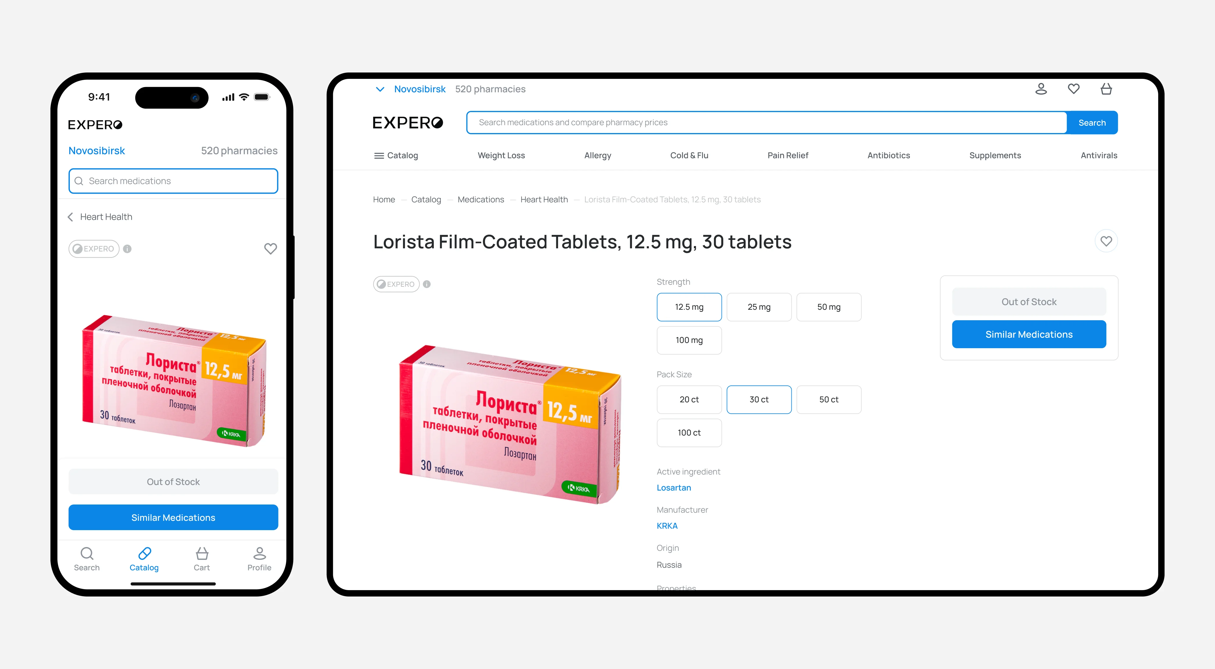
Another issue was that out-of-stock product cards were hidden from users, which made users think those products did not exist. Those product cards could instead become entry points to alternative recommendations.
First, I ensured that out-of-stock products remained visible with a clear "Out of stock" status. I then mapped the customer journey and collected feedback from backend engineers and the CEO. After approval, I presented the solution to the product team and moved into UI design and usability testing.
We introduced strict matching rules: recommendations had to match the active ingredient, dosage, and dosage form to prevent unsafe substitutions.
We launched a medication alternatives feature. The primary entry points were:
- product card with "Out of stock" status;
- product details page with "Out of stock" status.
Zero-result searches decreased, while add-to-cart conversion improved.
Conducted data analysis, customer journey mapping, cross-team alignment, UI design, usability testing, and presented design decisions to stakeholders throughout the project.
You can learn more about these and other cases during a call.